Reflective Week 7-8
Reflective week 7-
During week 7, it was our last week with lessons in school, during this week we had no more lesson, but we still could advance with our projects. It was this where I had most of my work done. We also presented our first Work in Progress using Microsoft teams in the “cyperspace“ where everyone showcased their progress in the project.
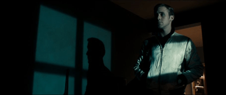
This week I wanted to have all my 3d renders ready because I knew it would be the thing that would take more time to render. But since I decided in the week before to use the sketch and toon shader on my 3d animation, the renders and animation worked pretty fast. During this time, I animated using a moving camera down and up to imitate the movement of the shoe entering the atmosphere, landing and then taking off. Used spaceship model to cut through transition. With the space ship model I also explored in cinema 4d the trail option which allows vertexes to leave a train in their movement, this created a really cool effect of the spaceship spitting out energy from the back, leaving a trail like airplanes leave a cloud.
For Thursday we had to have our WIP meeting where everyone showcased what they had until now. I had most of my video done, was just missing 2 3d scenes and the outro, with also missing the shoes animation. But overall, the feedback was positive. The intro of the “live life text” did not really fit in with the rest of the animation.
This week as we had to work at home, and we couldn’t leave the house I was able to advance progressively through my project. My plan was for after to finish the rest of the scenes during the weekend.
Reflective week 8 –
The last week of the term, I finished up my animation 1 day before the deadline. The Weekend I finished the 3d scenes, took pictures of my shoe, and did frame by frame animation with small movements and hand drew all the particles also with frame by frame animation. I finalized the deliverables but came up with problems before the delivery because I badly rendered the day before and had to redo it, and then the file was not rendering. I delivered late.
So during the weekend I finished up my final landscape and the outro with a model of a planet and the rings around it saying “To the max“ around the orbit. During the weekend I was also able to take pictures of my shoes and composed the pictures with only the to make him interact with the environment, I really liked experimenting to mix 3D animation with 2D frame by frame animation, I like the visual style that it could produce.
In my postproduction I decide to add some vhs screen effects and little glitches throughout the video, this added a bit more or 70’s vibe to the animation and It ended up fitting well with the music and style of my video. When the video was almost finished, I did the Instagram cut out, where the only thing was the framing of the intro sequence and outro.
In the end I had some problems with the render, the file became corrupted and it was not rendering the project. After hours of trying different techniques to find the source of the problem I decided to render the animation with out the post editing effects of the screen glitches and effects. And added later over the rendered animation video.
Pop Task 6 – ARS Eletronica FutureLab
ARS Eletronica future lab is an atelier and laboratory with the aims of research and development of areas of science/technology, art and society. They use art as a medium of expression to simplify the transition of social or scientific information, or as they say on their website, “food for thought”, this sector is more aimed at education and younger generation with the pretext of art to promote innovation. They are transdisciplinary where they bring together teams with artists, scientists, thinkers, sociologists to work on projects. Helping partner organizations that are working on innovative technology, to review and solidify the collaboration between research and development, artistic output and product enhancements. They also focus a lot on the importance of society that forms a future, that individuals are members of society. With the intent to find ways to motivate, empower and inspire.
Inside their ARS lab there are various topics in which they subdivide different areas of their work, which they believe are important for the future. For this research id like to particularly focus on the Arts and Science topic.
Art is a universal medium of communication, regardless of where you come from, or where who you are, art can always leave an image. Art has the strength to be able to open up new perspectives and simplify thematically complicated environments. Advanced science and technology have a lot of problems of communication, because they have in fact highly complex environments. Especially when science tries to reach a broader audience or even to the younger generation.
In order aid this process for Science and technology, Ars wants to focus on being able to communicate the social importance and meaning. Turning scientific facts into artistic expression, art can generate curiosity and awareness. Using art to communicate what Ars Eletronica Futurelab. An example of one of their projects in this field is the Fifty sisters project.
Fifty sisters, A project by Jon MacCormack talk about a sequence of 50 1mx1m images of plant forms that are computer made. Made of algorithmically “grown” from computer code. Each plant-like form is derived and made up of the early primitive look the logos from oil companies. These maps were generated using something called “computer genes” which is inspired on how genetics works, basically these flowers were created through computer generated evolution to create procedurally generated pre-historic flowers that go through mutation and selection.
This project does not only show the limits of how technology and programming can almost imitate the processes of nature like genetics, but also comes with a strong message for today’s times. With the global temperature rising and one of the leading reasons is the pollution of the oil drilling and the negative impact of oil spills. This work is a critique to the oil industry shaping our society and destroying our planet, fossil fuels began as plants that over millions of years were transformed due to geological processes into coal and oil. Basically, the oil companies now own and monopolize these pre-historic plants, making these plants only made of their logo.


What ARS Electronica futurelab is q very innovative and forward-thinking way to bring different topics and areas together to work in symbiosis. The Multi-disciplinary aspect to research and development can really help with enrichening knowledge and broadening the communication of science and the importance of working all together. The example of how Jon MacCormack was able to showcase technology and a social critique into a piece of art made the message a lot stronger.
Blog Task 5 – 3D elements in motion Design
The surge of 3d modelling and animating software’s was a big frontier in the world of motion design, from animation to advertising to cinema, it has been seen to be big game changer to the whole business. Now a days most videos are watched on mute because of thumbnails and scrolling in social media, brands now a days have to change tactics and move more visually pleasing videos. Companies now a days require and need to have at hand high end illustrative ways of representing their brand or story in the case of cinema. The possibility of 3d programs to create highly realistic 3d graphics/ 3d motion, that easily relates the viewer to reality makes the narrative appear more appealing and eye-catching.
3D animation has enabled unimaginable possibilities designing and showcasing commercials and storytelling, mixing 2d and 3d graphics to create high end realistic animation videos that completely amaze viewers. It has unlimited the possibilities for motion design, literally anything can be made now a days, all made with computer graphics, people can bring their imagination to reality. From a more cartoony style to ultra-realistic animation or even VFX.
One of the most interesting and hardest of these processes is the usage of VFX. I will showcase and explain the different possibilities for the industry.
VFX is the usage of visual effects for movies ( especially used in Hollywood movies) it is especially used with the combination of live action video captured shots with objects created in 3d software’s from creating movies with hyper realistic representations of such things as environments and characters. This started in the 1980’s in the movies industry and has since evolved to become one of the leading reasons to catch the viewers attention.
This process only happens at the post-production stage of the process, but it requires to be carefully planned and choreographed in the production and during the shooting of the scenes.
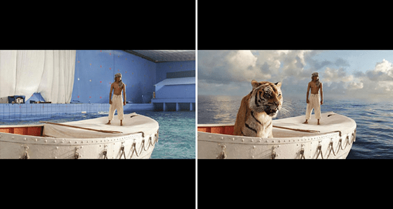
This scene from the movie “Interstellar” directed by Christopher Nolan, VFX by DNEG, about space travelling showcases some jaw-breaking examples of VFX from truly realistic spaceship, realistic time warping and scientifically accurate space oddities such as a black hole and even a realistic but also abstract scene in the “4th dimension”. The usage of VFX in this movie is truly beautiful, it makes the storytelling truly appealing and immersive for the viewer.
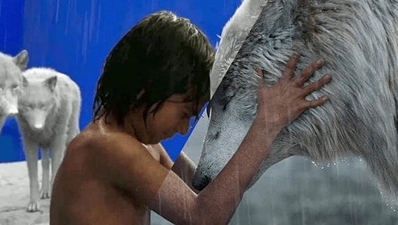
While VFX can be used to immerge the actors into various different fictitious environments like avatar, it can also introduce highly accurate monsters, aliens or other fictitious characters. (Great example like “Hobbit” trilogy, “Star Wars”, “War for the planet of the apes”,” Avatar”). A great example is of the “The jungle book” (2016), by Jon Favreau, VFX by MPC and Weta Digital, shows how animals can be given realistic and human like attitudes without the viewer recognizing the difference between reality and fiction. Creating realistic hair like gravity to the animal’s fur. This scene from the movie really shows how a giant orangutan can be super well animated like a human.
There are various techniques used to best aid the process of VFX. Most of these require certain specifications during the shooting of the scenes so that VFX can easily integrate the visual effects. From using green (or blue) screens to combine 3D scenes with 2D scenes;
Prosthetic makeup applied to character, using sensors attached to people, VFX can properly emulate the human like movments that are then attached the 3D graphics that follow those sensors.
Matte painting which essentially is 2d shots cut up and placed with depth to give idea of a 3d environment.
Digital compositing is assembling digital assets and live-action footage to bring together a shot for a film or game.
There are infinite possibilities now a days for what 3D elements and animation can do, it has turned the world of animation and cinema around. Now a days movies can be disregarded for their story, but the VFX can completely change that, Hollywood movies spend a lot of money on Visual effects because it keeps people entertained to watch the unimaginable happen.
https://www.cgspectrum.com/blog/what-is-compositing
https://www.imediabay.com/creative-blogs/present-and-future-of-creative-advertising.php
https://en.wikipedia.org/wiki/Visual_effects
https://en.wikipedia.org/wiki/Computer-generated_imagery#Architectural_scenes
Reflective Writting 4-5-6
Week 4
During the 4th week we explored better how we can use type in aftereffects to give life to words, we explored how to rotoscope a small video and how it can be used to give real-life feeling to an animation. We explored during our pop task how film techniques can influence motion design and animation. We also explored using multiplanar shots or parallax effect, to give depth and 3 dimensions to animation using layered planes. Through this week we also finished up our summative 1 project.
During our classes during this week, the different techniques we learned in class, from rotoscoping, motion typography and parallax layering. Are various techniques that even though It was already late to use in my project they are going to be very advantageous for future projects.
Throughout the last week of the ABFAB I was able to finish my animation based on my animatic only using in adobe animate. Since I have always enjoyed, the hands-on part of drawing, doing 17 seconds of frame-by-frame of my video was not very hard and editing it with the sound was also quite intuitive. Some aspects of my final animation which I wish I had better developed, were the background pattern of the video, the framing of some scenes and the editing of the voice over. At last minute before finishing the animation I was worried the message I was trying to convey was not clear, so I tried to record a voice over with simple phrases and pop it in to the animation, when I was finished there didn’t seem to be problems with the sound of my voice but during the presentation it very badly edited and eventually decided to go back to the video with only music in the background.
The project did not come out exactly how I imagined it would, but I was proud of all the things I learned during these first 4 weeks and I know feel more prepared to start new projects. I learned to better organize myself and my projects to improve the outcome.
Week 5
The 5th week was the introduction to new summative briefing. We are tasked to create a video of 30 seconds for AIR MAX DAY 2020 where we showcase our shoe as a brand that represents our values. We are required to have a set of varied techniques involved in the video. From 3d modelling and animation in Cinema 4d, use elements of photography/Filming, 2D elements, our own created font and a pattern. Using and mixing these elements to finish with the video where we present our brand values, and it must later be edited to fit in a snapshot story for Instagram on the phone.
Through the week we had to start to prepare by doing research on the shoes we were going to use to represent us, their brand’s values and how they could relate to our values. I choose my New balance “By the sea” shoes, because they look like a spaceship, and this reminded me of that quote by Neil Armstrong “Small step for a man, one giant leap for mankind.” Which led me to my values and concept. The shoe is the medium for new experiences and to step into new worlds, the shoe is the spaceship that travels to the infinite space of experiences.
During the week I learned new techniques to animate and use different features of Cinema 4D from modelling to better optimizing the performance of the renders so that the scenes don’t take ages to render.
Learning 3D techniques had never been so interesting until this week. I think I already comfortable with the idea of my project and I can clearly envision what I want to do, I think my concept is strong, and I have gathered a strong visual reference with the music made by my friend ( 80’s synth wave) and my storyboard.
Week 6
The end of week 5 we had our pitch presentation, the week after that, was when I start with different aspects of my project. I was able to make my animatic efficiently with a hand drawn storyboard which gave me clear guidance for what I wanted my animation to look like.
I discovered a technique which I found that would fit perfectly with my video, using a shader (sketch and toon), You can render 3D scenes with a filter that give outlines and less realistic renders. But adds a lot of personality to the renders. This helps to have better control of the simple colour pallet I am using.
I started by modelling a spaceship, planets and a satellite to try different techniques and assets that I could potentially use for my video. I was able to render 2 scenes successfully with the sketch and toon filters, one of the spaceships passing in front of the camera, and a landscape.
I also finished the font that I will integrate as a 3D element, the following week. The font is a serif futuristic font, inspired by spaceship designs of movies like Star Wars and Star trek. The fonts will be split into the live life that will appear at the beginning of the video and to the max at the end.
For the next week I will finish the environments and 3D assets. I will also do all the 3D renders quickly because the sketch and toon does not require much time. I will then do some parallax effect with clouds and skies with planets and stars using the free aftereffects plug-in orb.
Blog Task 4 – Branding and Motion Design
Motion design was quite disregarded by brand design until not much time ago. Most brands give a tone of voice to the logo, the fonts and colours of the brand, but most didn’t really think about the brand’s behavioural sense. This aspect wasn’t really valued until much time ago. It can bring a lot of worth to the brands personality. With the introduction of new technologies and media, you can better enforce on how different elements behave and act.
Now a day’s motion design has been actively introduced into the world of branding, sparking a wave of creativity and possibilities for brands to expand their look and voice. A company London-based, called Moving brands specialized giving brand’s a more interactive experience making their logos and design animated reflecting the brands values. They use and explore motion design from various angles. Not only to animate but also use the process of animating to create new ideas and visuals for their designers and brand designers material: “Through motion design exploration we are able to create different expressions of a brand, which can communicate a lot about the character of a business.”
For a brand to communicate what it does and who it is, the use of motion and sound can reinforce the user’s sense of it. Motion helps to create the story and give personality to it, while giving its background and backstory. The way a movie has movement that tells a story, that you can take an instance a work of photography, branding can use instances of motion to create visual references for its design. Moving Brands use motion design and branding designing in parallel so they can complement each other. Having moving references of real-world movement can give dynamics and gravity turning the design more like real life.
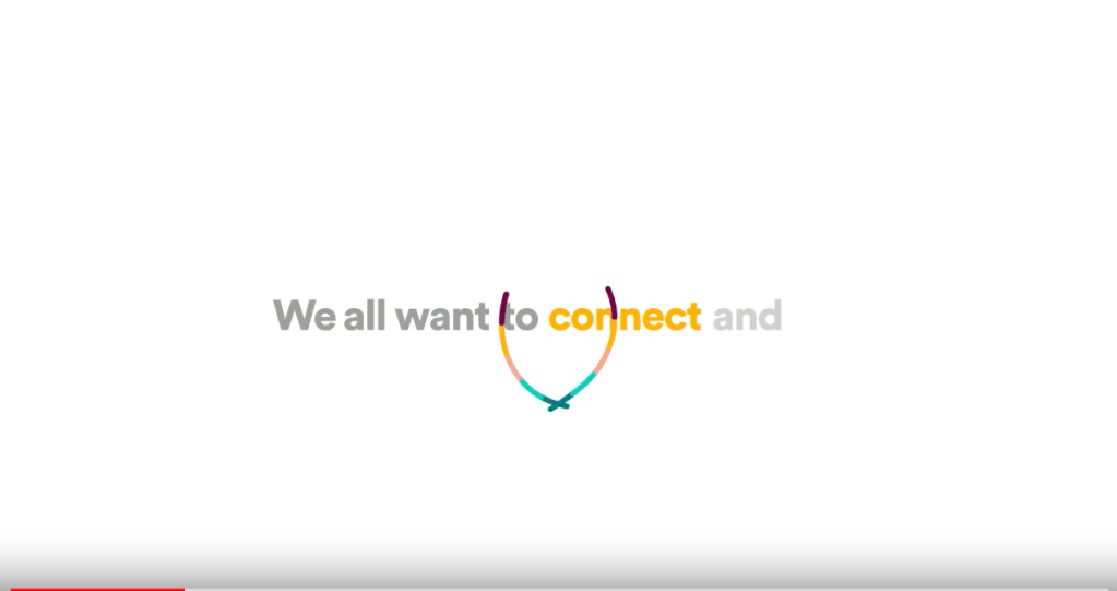
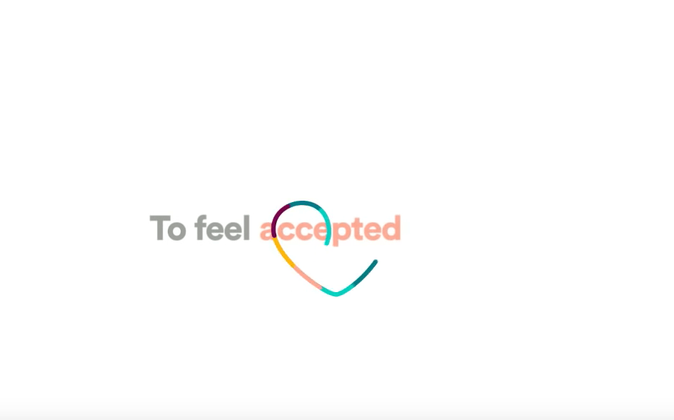
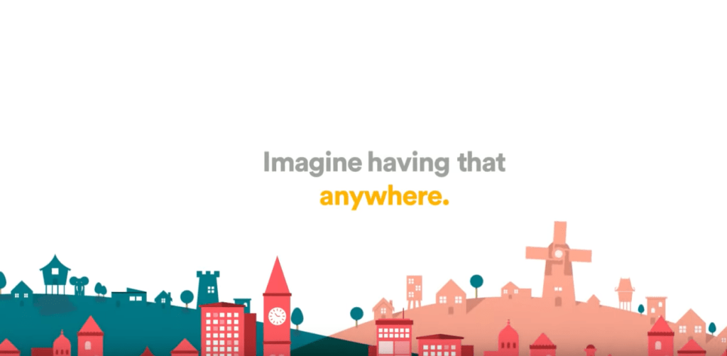
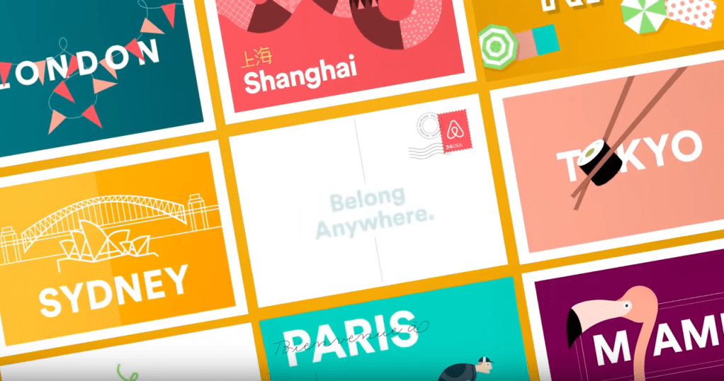
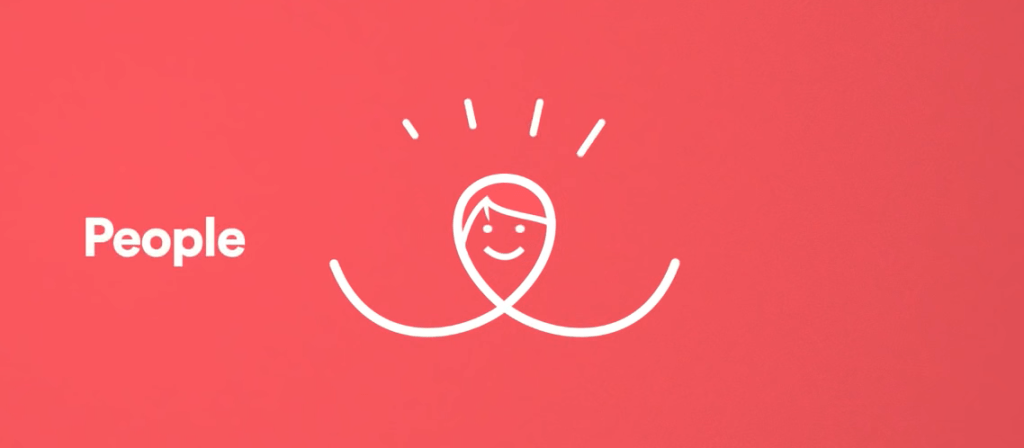
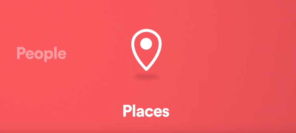
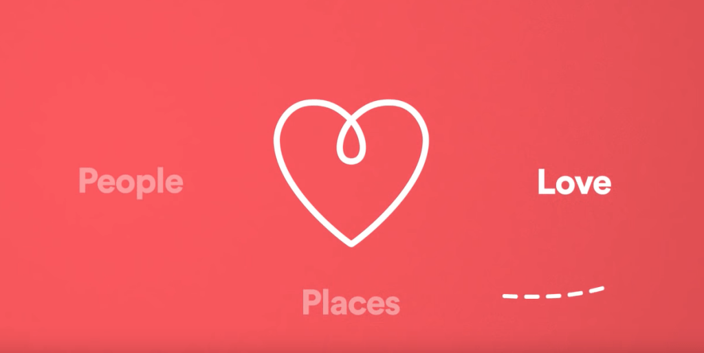
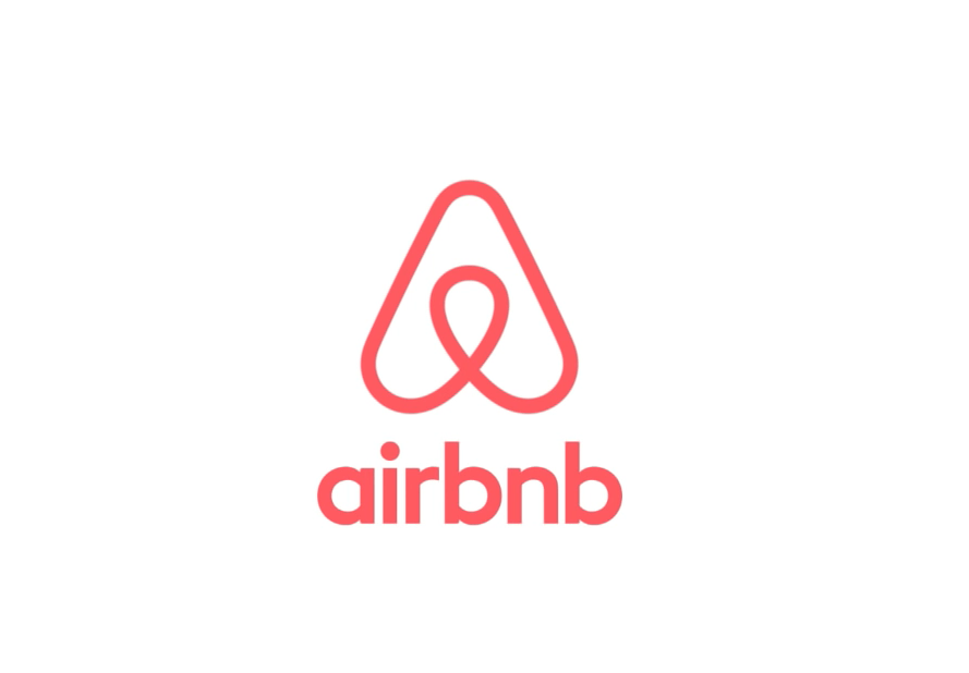
A good example of how Brand design benefited from the motion design is in the project of the Rebranding of Airbnb made by DesignStudio. Their first approach to it, was by asking themselves how the world saw Airbnb and how Airbnb saw itself. While the user saw an online booking platform. They wanted to be more than just that, they wanted to make people associate their brand to a feeling, to promote their values and not just a medium. They wanted to be a global community of users, based and trust. They wanted their users to be able to “Belong anywhere”. With this came the introductory animated video for their new logo using the pretence of belonging anywhere. The video “Beló: the story of the symbol of belonging.”. The video tells the story of their brand values and mood. A sequence of simple san-serif fonts accompanied by colourful lines that highlight important words (Connect, place, safe, share) with smooth movements and simplistic illustrations that also emphasize these values.
The word connect is accompanied by two smooth lines intersecting with each other.
The word accepted is accompanied by a line making a tracing a heart.
The word anywhere by illustration of different building styles from different parts of the world, a paper plane flying to turn into stamps from different places of the world to demonstrate the global reach of Airbnb.
The animation explaining what Airbnb new logo represents with a line circling around to form different shapes that represent people, places and love to eventually form the Airbnb logo.
Motion design will take a big role in the future of design, taking traditional animation into the next level, with growth of new technologies and screen oriented platforms, there is a need for the UI ‘s to integrate design and choreography to helps users navigate Interfaces and virtually make people feel.
Task: Blog Topic #3
Cinematography, the art of photography and camerawork in film-making. This art applies different techniques that apply proper visual effects that can alter the emotional predisposition of a viewer. The broad theme seeks to set moods, transmit messages and concepts to be clear to the viewers without it literally explaining it. Such things as lighting, camera placement, colour, framing, shot structure, shot transitions can affect the viewers feelings and mood.
Lighting is used to set mood, direct the attention of the viewers and provide information. Light up a scene to make it happy and take light away to give it a more dark and sinister mood. You can light a particular scene to direct the attention of the person watching.
Cold lights can emit sadness, quietness, danger, fear.
Warm lights can represent relaxation, happiness, tranquillity and cosiness.
Colour in cinematography can be used in various ways to either change the mood, create contrast or direct the attention of the viewer and set the environment for the scene, the person concerned needs to manipulate the hue of the colour, its brightness and its saturation to evoke the desired effect. Unsaturated colours for duller and sadder moods and more saturated colours to evoke more intense emotions. Brighter and darker colours to create contrast and attract the viewers attention. And changing the colours to evoke a particular emotion.
The kid from It movie (2017, Andy Muschetti), the kid’s yellow jacket represents the innocence and ingenuity of a child. It is contrasted with the dark and unsaturated environment that gives the viewer uneasiness and an ominous feeling, preparing the viewer to be scared to the kid that strayed away in the rain.
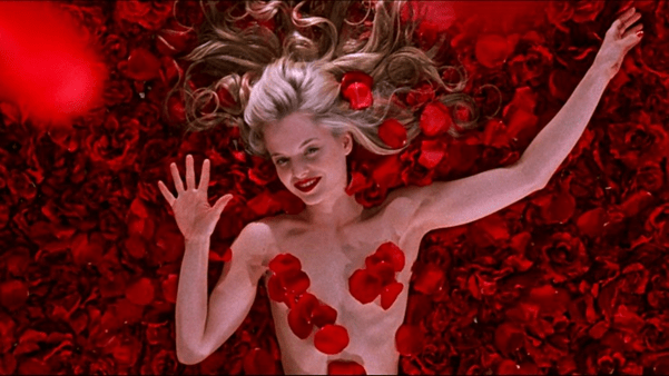
The scene from the well-directed “American Beauty” (1999, Sam Mendes) represents intensity the feeling of love using intense vivid red petals overwhelming the screen.
Changing the camera placement can evoke also various insight for the viewers, such as a camera looking from below to above can give idea of grandiosity and emphasize the viewer by making him feel inferior to the scene or from above to below making the viewer feel bigger. The movement of the camera is also important for it can directing the viewers’ attention and or inform him to switch his focus.
The shot Structure refers to the placement of shots inside a scene, choosing between deductive and inductive shot sequencing, this to highlight the objects or characters relationships existing between the subjects of a scene.
The special thing about animation that sets it apart from cinema is the capacity of doing whatever you want with these principles of cinematography and play with them without limitations.
For my case study of the subject, I want to do it of one of the most innovative and creative works of animation of the recent century, BoJack Horseman by Raphael Bob-Waksberg, where it combines various techniques of cinematography to emphasize its dark comedy drama environment where it mixes human and animal like human creatures living together in the same world. Constantly Directing to impact the viewer attention to either laugh or cry.
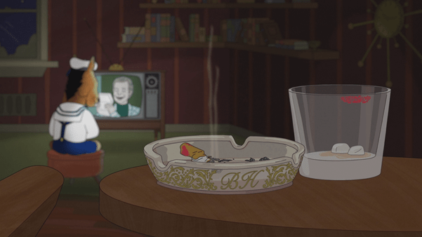
This scene from the show shows, the young protagonist Bojack Horseman staring at the TV, a kid yearning for attention. The colours of the shot are unsaturated and dark to represent the eerie and sad environment, one of the most important moods of the shot is the camera placement in the front plane of the ashtray with the unlit cigarette and the finished cup of alcohol. This scene indicates the user of an unattended child, the mother is present but not in the shot, showing the alcoholic behaviour of the mother. The strong red lipstick stains on both cup and cigarette function to create a connection between the two.
Another creative and amazing shot sequence of the show is the intro. The intro changes throughout the seasons, but the shot sequence is always the same. The sequence follows a pinned frontal camera on our character, with match cut editing (cutting between one shot to another while maintain the main subject or action in the same position) travelling between different environments and times. With lighting, camera movement following and colours changing to describe the characters development and setting of the show.
While film has some limitations of what in can do, where you have to pay a lot for amazing equipment and create complicated shots, animation on the other hand does not, and allows the creators to manipulate all the techniques in film and more. Bojack horseman has various examples of how these techniques were used to create drama and comedy.
Links and Sources:
Work Week 3 – POP Task #2
Samuel Rodeia 9060
The word, typography, is derived from the Greek word’s typos “form” or “impression” and graphein “to write”.
Typography can be considered to have begun since the invention of language itself, although the first records of an official typeface with all its rules and characteristics are from Japan.
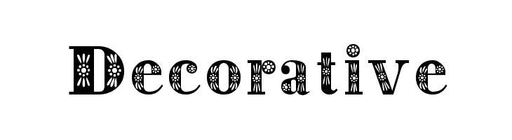
There are various ways you can manipulate and design typefaces in order to alter its meaning and story. You can change the type ( Serif, San-serif, script and decorative)

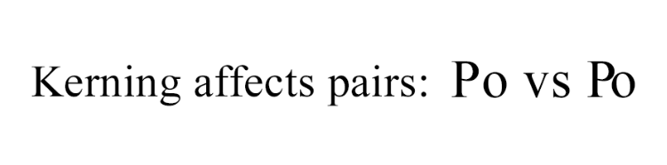
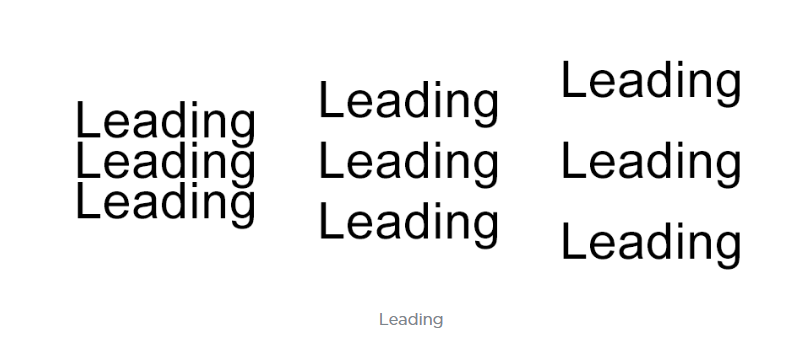
and in these types you can change its anatomy ( Kerning, tracking, leading). All these attributes can influence how the viewers feel and react to what they are seeing, without them even noticing it in particular.
Typography is the process and technique of arranging type to make a written language legible, readable and appealing when displayed. Typography in Motion design can be treated the same way as any other type of design, except you can now control also the type’s movement which can help give the character more personality. Fonts are a direct and clear way to invoke a message or a meaning and animating it can give words a whole back story the same way Fonts and typefaces also give fonts characteristics.
“A font can completely transform the meaning of a word, it can give it a backstory, it can give it a personality, and it can turn it to something that it can influence.”
She considers that fonts serve as clothes for words. The same way, that when we look at a human, one of the first impressions is that of what clothes he is wearing, it gives away characteristics and personifies that person. This is a good example of how fonts can give a disguise to words, where it not only works as a symbol for what is written, it can also help the viewer, unconsciously, evoke an experience, that emphasise its meaning and message.
This video by YouTube page Ji Lee, shows how the way we can animate words anatomy to reinforce its meaning. This can be used to emphasise the meaning of the word: Inflation’s “o’s” piling ups to the millions, The “m” in stock market like a stock graph, vertigo falling letter emphasizing the feeling, the I in magic disappearing.
This animation of Stephen Elliget uses typography visually tell the narrated story, animating the fonts to act as the words represent: as he says “he’s hiding something”, the word something is revealed from under the word hiding, and when the narrator asks “what’s he building in there?” the words are arranged to form a house and a closing door, as if there was something mysterious being closed off to the viewer.
There are various animations where the artist uses typography as the main constituents of it, being reinforced by all the things that you can manipulate with typography. To strengthen the value and/or trick the user, making the user think twice about the story behind the word.
Work week 3 – weekly reflection
Samuel Rodeia
During the third week, we started with the production phase of our ABFAB projects, we also worked on our pop task for the week where analysed how semiotics and colour are used in infographics around various types of media, and finally we also started to learn how we can do frame by frame animation using photoshop, where we did a small video with the 12 principles of animation.
The pop task we had to do a case study on semiotics where we show what we understood how signs with signifier and signified, can be used to deliver a complex messages using very simple shapes, forms, colours, motions, sounds and music. By seeing how motion graphics and other design mediums could use semiotics to enrichen its context and purpose.
Animating the frame by frame animation was my favourite of this week. Trying for the first time, it was very intuitive and powerful way of animating. And also we did an animation where we had to demonstrate the 12 principles of animation. It helped a lot with really getting hands on drawing introduction to animating bases. I enjoyed it so much, I decided to take it further, by learning more about animating and using adobe animate, where it allows to take it a step further with frame by frame animation, using vector drawing.
This week overall I could have advanced more with my production to have gotten better feedback on my work in progress, but im sure having taken the step to do frame-by-frame for my animation will add the missing piece to my short short. During this next week I will first finish my animation, and then add final sound effects and maybe consider a voice over.
Work Week 2 – Blog task #1
Semiotics is the study of signs and its use as a medium that influences behaviour. It is treated by Saussure as a language of sign-systems. Semiotics is treated like a language based on signs with signified meanings. The notion of the sign can be described various ways: the oldest one refers to it as something that is used in place of something else, but this can change culturally and socially. One of the most known concepts in semiotics is that of Saussure’s distinction that the sign is broken up by the Signifier and the signified.
The signifier is the is the literal representation of something. (So the word C-A-T, an image of a cat, or even the word sound “miau” are the signifier’s of a real life cat, but it does not particularly represent the cat) These can change according to the language and place where you live).
Then we have the Signified, it is defined as the concept, or the meaning behind the signifier. This can also change depending on the perceiver, it is an internal perception to them, the semantic content associated with something. (For example an image of black cat, for many it is a symbol that represents bad luck, to others a symbol of death, or even to some people it is the opposite and it represents good luck.)
According to Saussure, the signifier creates and forms the signified depending on the meaning it triggers in us. A sign needs both the signifier and the signified as formed by the interpreter.
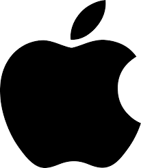
Around Design and the visual art, semiotics is the key language needed in order for it to properly work, a combination of symbols with both signifiers and signified that all together represent well a message or a concept. To better understand this, I’m going to analyse the semiotics and thinking behind the brand Apple. One of the most known brands and logo’s around the world. Im going to analyse its signifiers and its signified meanings, while also giving an idea of the big impact it had on the world.
Apple’s concepts and ideals centre around bringing to the world new and innovative concepts, they want to transmit an idea of commitment and dedication to always bring in as they say “Best computing experience” ( Good examples of how they succeeded with Macbooks, iphones, ipods and all its “iservices”, are now part of peoples everyday lives). One of the reasons for its success is the design thinking behind the whole brand, how it is accessible and understood around the world. This gives the brand a Humanistic aspect, it is closer to its users compared to companies that are more “mechanical” and more distant.
By keeping its designs simplistic and minimalistic, Apple first logo (designed by Ronald Wayne) was an image of Sir Isaac Newton sitting by the tree contemplating. Semiotically the first logo’s signifier was the based on the story, of when the apple fell on sir Isaac newton’s head and he discovered later on gravity because he wondered why it fell. Other signified meanings can be for example how the fruit apple, transmits an idea of ‘desire’ and ‘eagerness’ because of the story of Adam and Eve.
The logo was later deemed too complex, and as the company’s message was to ‘simplify life’, so they simplified the logo, and all its visual language. They appointed graphic designer Rob Janoff, where he designed the iconic apple logo with the rainbow colours in it. The apple has a bite taken out it. This can be understood semiotically around various cultures. The bite taken out of the apple is to represent an apple and not any other fruit. (this is the signifier) And the meaning behind the apple ranges from a simple and basic everyday object. It can deeper and more specific meanings to different cultures and location, but mostly the apple represents as a symbol of Health, Icon of nature.

Other semiotic analysis can uncover various smaller and/or more specific meaning to the company’s logo. From the bite in the apple representing bytes ( the unit of technological data), The rainbow colours can be seen as humanizing and inclusive, and finally we can suppose the religious and mythical connection the story of Adam and Eve, semiotically it can resonate with the Apple, because they were rebellious compared to the competition at the time.
Apple semiotically is a good example of how a simple representation of an Apple can contain so much meaning, reflecting the company’s design and ideals with respect to its audiences. The brand was able to form a very simple logo that transmits a unique and permanent memory in the mind of the consumers to the point where the brand itself can already be a signified meaning of the signifier for an apple.
An example of how apple design is used coesivly and with semiotics concepts in mind, is this infographic animation video, where the brand showcases their inventions and history of products. Where from product to product appear symbols that are Signifiers of the product, the video’s staging, animation style and music work as signified signs that still represent the innovative and simplistic tone of voice of the brand. This is a good example how we can use semiotics to better represent more complex concepts with a clear and effecient language that is acessible to everyone.
https://pt.slideshare.net/RohitRohan/semiotics-analysis-of-the-apple-inc-logo ( Rohit Rohan, 2013)
http://www.signosemio.com/elements-of-semiotics.asp ( Louis Hébert, 2014)
BMD – Summative Reflection (Week 1 -2)
During the first two weeks, for our ABFAB project “short shorts”, where were we are tasked to do a short animation video of 20 seconds where we present ourselves or a part of ourselves. I decided to do mine about a specific aspect of my life that I consider to be quite important, this is, the part of my life I was faced with independency and loneliness. The moment I left my parents and adventured for the first to go and live alone. It was right after a part of my life where the family started to go separate ways and so did I feel the need to do that myself and grow up.
During these first two weeks of my project I worked on my conceptualization and preproduction of the animation. Learning how to better organize and deliver a pitch like if it was for a real-life client.
First, I had to figure out how I could present this specific moment of my life, and since it is quite a personal subject, I decided to take a metaphorical approach, combining two topics I particularly like. Art and biology. I have been reading a book called “Self comes to mind” by Antonio Damasio, a Portuguese neuroscientist. In the book he explains how our will to live from the first unicellular organism, that also had this function: Survive as long as you can. He compares humans to cells. Cells went from unicellular to multicellular organisms when they found that they could join forces and create multicellular organisms that eventually created humans, same way humans join forces to survive more (societies and cultures).
Since this was a quite complicated comparison, I figured I could use simple abstract art and shapes (also relating to Saul Bass) to clearly explain it, plus it is a subject that is easily understood by various ages and backgrounds. The first thing that came to mind was non-objectivism, where artists like Miró, Mondrian, Kandinsky, Pollock expressed a lot with simple colours and shapes, creating a strong emotional impact with the viewers. I particularly inspired myself on Joan Miró, where his style reminded me that of Saul Bass.
To complement this I decided to give my animation a more spontaneous and abstract sound to it with Jazz.
Now to fit a strong metaphor into 20 seconds wasn’t particularly easy, and even though I was able to properly create a script and a visual style that represented my concept and story, I still feel like I need to change something for my story to be more infographic style and less abstract. I was able to produce an animatic that showed well where my project was going, but I think mostly, people understood it because I had already explained my concept to them with the pitch. So to improve my work Im going to explore voice over or implement keywords and/or phrases so that the message can be communicated more clearly. This feedback was very useful for me because I was not sure my concept was too personal. Apart from that people seemed quite interested and empathetic with the idea for my project.
If I could have changed something in my process during this phase, was to have focused more on the script earlier on, and better developed my idea being more careful with not making it too personal. During these first weeks I learned the importance of dedicating more time and giving better thought not to the final look of the project but to the ideation and preproduction of it. If well organized and structured, a project that is prepared for its process can truly give a strong backbones and structure to it. I learned different tools and techniques I can use during this phase, to improve my script writing, my storyboarding and conceptualization. Overall the first two weeks have helped me truly appreciate this process.
