Motion design was quite disregarded by brand design until not much time ago. Most brands give a tone of voice to the logo, the fonts and colours of the brand, but most didn’t really think about the brand’s behavioural sense. This aspect wasn’t really valued until much time ago. It can bring a lot of worth to the brands personality. With the introduction of new technologies and media, you can better enforce on how different elements behave and act.
Now a day’s motion design has been actively introduced into the world of branding, sparking a wave of creativity and possibilities for brands to expand their look and voice. A company London-based, called Moving brands specialized giving brand’s a more interactive experience making their logos and design animated reflecting the brands values. They use and explore motion design from various angles. Not only to animate but also use the process of animating to create new ideas and visuals for their designers and brand designers material: “Through motion design exploration we are able to create different expressions of a brand, which can communicate a lot about the character of a business.”
For a brand to communicate what it does and who it is, the use of motion and sound can reinforce the user’s sense of it. Motion helps to create the story and give personality to it, while giving its background and backstory. The way a movie has movement that tells a story, that you can take an instance a work of photography, branding can use instances of motion to create visual references for its design. Moving Brands use motion design and branding designing in parallel so they can complement each other. Having moving references of real-world movement can give dynamics and gravity turning the design more like real life.
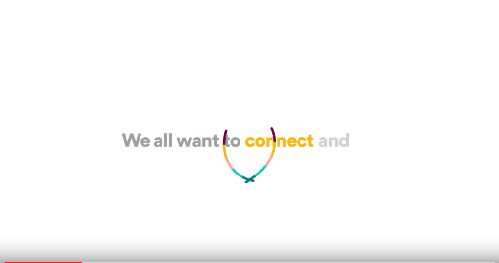
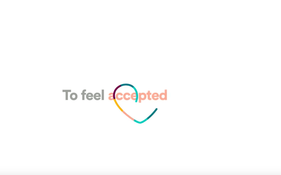
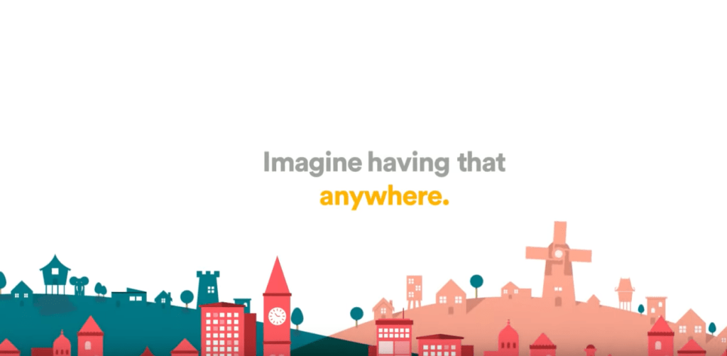
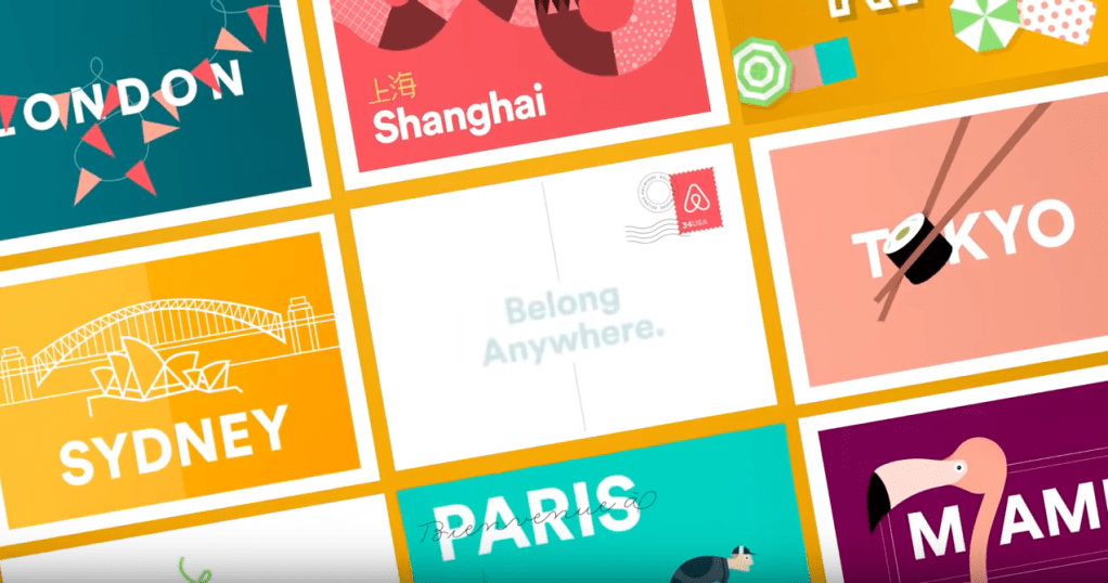
A good example of how Brand design benefited from the motion design is in the project of the Rebranding of Airbnb made by DesignStudio. Their first approach to it, was by asking themselves how the world saw Airbnb and how Airbnb saw itself. While the user saw an online booking platform. They wanted to be more than just that, they wanted to make people associate their brand to a feeling, to promote their values and not just a medium. They wanted to be a global community of users, based and trust. They wanted their users to be able to “Belong anywhere”. With this came the introductory animated video for their new logo using the pretence of belonging anywhere. The video “Beló: the story of the symbol of belonging.”. The video tells the story of their brand values and mood. A sequence of simple san-serif fonts accompanied by colourful lines that highlight important words (Connect, place, safe, share) with smooth movements and simplistic illustrations that also emphasize these values.
The word connect is accompanied by two smooth lines intersecting with each other.
The word accepted is accompanied by a line making a tracing a heart.
The word anywhere by illustration of different building styles from different parts of the world, a paper plane flying to turn into stamps from different places of the world to demonstrate the global reach of Airbnb.
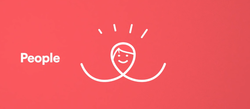
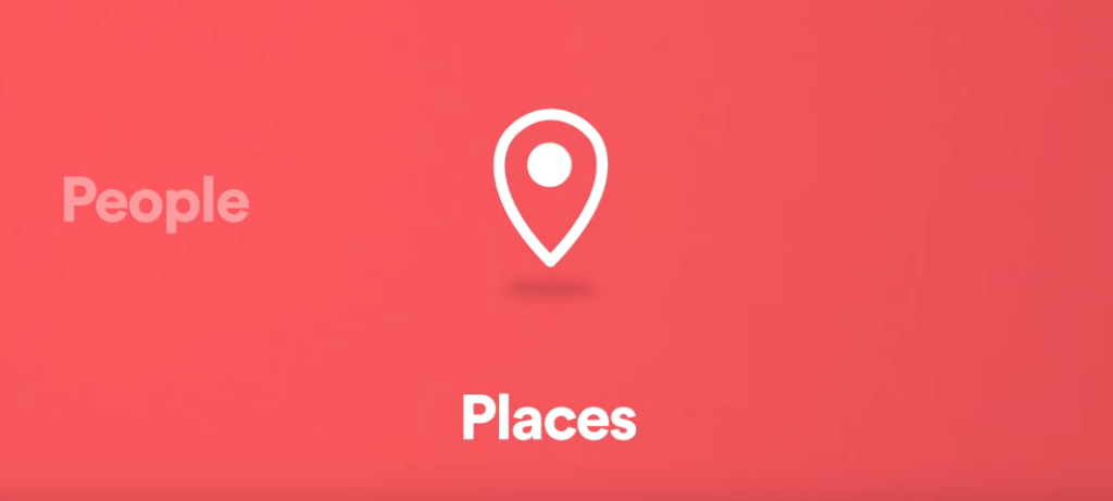
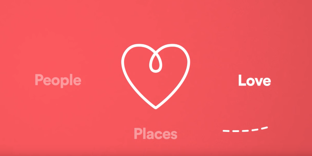
The animation explaining what Airbnb new logo represents with a line circling around to form different shapes that represent people, places and love to eventually form the Airbnb logo.
Motion design will take a big role in the future of design, taking traditional animation into the next level, with growth of new technologies and screen oriented platforms, there is a need for the UI ‘s to integrate design and choreography to helps users navigate Interfaces and virtually make people feel.
