Samuel Rodeia 9060
The word, typography, is derived from the Greek word’s typos “form” or “impression” and graphein “to write”.
Typography can be considered to have begun since the invention of language itself, although the first records of an official typeface with all its rules and characteristics are from Japan.
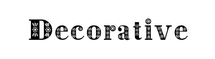
There are various ways you can manipulate and design typefaces in order to alter its meaning and story. You can change the type ( Serif, San-serif, script and decorative)

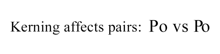
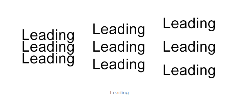
and in these types you can change its anatomy ( Kerning, tracking, leading). All these attributes can influence how the viewers feel and react to what they are seeing, without them even noticing it in particular.
Typography is the process and technique of arranging type to make a written language legible, readable and appealing when displayed. Typography in Motion design can be treated the same way as any other type of design, except you can now control also the type’s movement which can help give the character more personality. Fonts are a direct and clear way to invoke a message or a meaning and animating it can give words a whole back story the same way Fonts and typefaces also give fonts characteristics.
“A font can completely transform the meaning of a word, it can give it a backstory, it can give it a personality, and it can turn it to something that it can influence.”
She considers that fonts serve as clothes for words. The same way, that when we look at a human, one of the first impressions is that of what clothes he is wearing, it gives away characteristics and personifies that person. This is a good example of how fonts can give a disguise to words, where it not only works as a symbol for what is written, it can also help the viewer, unconsciously, evoke an experience, that emphasise its meaning and message.
This video by YouTube page Ji Lee, shows how the way we can animate words anatomy to reinforce its meaning. This can be used to emphasise the meaning of the word: Inflation’s “o’s” piling ups to the millions, The “m” in stock market like a stock graph, vertigo falling letter emphasizing the feeling, the I in magic disappearing.
This animation of Stephen Elliget uses typography visually tell the narrated story, animating the fonts to act as the words represent: as he says “he’s hiding something”, the word something is revealed from under the word hiding, and when the narrator asks “what’s he building in there?” the words are arranged to form a house and a closing door, as if there was something mysterious being closed off to the viewer.
There are various animations where the artist uses typography as the main constituents of it, being reinforced by all the things that you can manipulate with typography. To strengthen the value and/or trick the user, making the user think twice about the story behind the word.
