Semiotics is the study of signs and its use as a medium that influences behaviour. It is treated by Saussure as a language of sign-systems. Semiotics is treated like a language based on signs with signified meanings. The notion of the sign can be described various ways: the oldest one refers to it as something that is used in place of something else, but this can change culturally and socially. One of the most known concepts in semiotics is that of Saussure’s distinction that the sign is broken up by the Signifier and the signified.
The signifier is the is the literal representation of something. (So the word C-A-T, an image of a cat, or even the word sound “miau” are the signifier’s of a real life cat, but it does not particularly represent the cat) These can change according to the language and place where you live).
Then we have the Signified, it is defined as the concept, or the meaning behind the signifier. This can also change depending on the perceiver, it is an internal perception to them, the semantic content associated with something. (For example an image of black cat, for many it is a symbol that represents bad luck, to others a symbol of death, or even to some people it is the opposite and it represents good luck.)
According to Saussure, the signifier creates and forms the signified depending on the meaning it triggers in us. A sign needs both the signifier and the signified as formed by the interpreter.
Around Design and the visual art, semiotics is the key language needed in order for it to properly work, a combination of symbols with both signifiers and signified that all together represent well a message or a concept. To better understand this, I’m going to analyse the semiotics and thinking behind the brand Apple. One of the most known brands and logo’s around the world. Im going to analyse its signifiers and its signified meanings, while also giving an idea of the big impact it had on the world.
Apple’s concepts and ideals centre around bringing to the world new and innovative concepts, they want to transmit an idea of commitment and dedication to always bring in as they say “Best computing experience” ( Good examples of how they succeeded with Macbooks, iphones, ipods and all its “iservices”, are now part of peoples everyday lives). One of the reasons for its success is the design thinking behind the whole brand, how it is accessible and understood around the world. This gives the brand a Humanistic aspect, it is closer to its users compared to companies that are more “mechanical” and more distant.
By keeping its designs simplistic and minimalistic, Apple first logo (designed by Ronald Wayne) was an image of Sir Isaac Newton sitting by the tree contemplating. Semiotically the first logo’s signifier was the based on the story, of when the apple fell on sir Isaac newton’s head and he discovered later on gravity because he wondered why it fell. Other signified meanings can be for example how the fruit apple, transmits an idea of ‘desire’ and ‘eagerness’ because of the story of Adam and Eve.
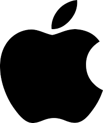
The logo was later deemed too complex, and as the company’s message was to ‘simplify life’, so they simplified the logo, and all its visual language. They appointed graphic designer Rob Janoff, where he designed the iconic apple logo with the rainbow colours in it. The apple has a bite taken out it. This can be understood semiotically around various cultures. The bite taken out of the apple is to represent an apple and not any other fruit. (this is the signifier) And the meaning behind the apple ranges from a simple and basic everyday object. It can deeper and more specific meanings to different cultures and location, but mostly the apple represents as a symbol of Health, Icon of nature.

Other semiotic analysis can uncover various smaller and/or more specific meaning to the company’s logo. From the bite in the apple representing bytes ( the unit of technological data), The rainbow colours can be seen as humanizing and inclusive, and finally we can suppose the religious and mythical connection the story of Adam and Eve, semiotically it can resonate with the Apple, because they were rebellious compared to the competition at the time.
Apple semiotically is a good example of how a simple representation of an Apple can contain so much meaning, reflecting the company’s design and ideals with respect to its audiences. The brand was able to form a very simple logo that transmits a unique and permanent memory in the mind of the consumers to the point where the brand itself can already be a signified meaning of the signifier for an apple.
An example of how apple design is used coesivly and with semiotics concepts in mind, is this infographic animation video, where the brand showcases their inventions and history of products. Where from product to product appear symbols that are Signifiers of the product, the video’s staging, animation style and music work as signified signs that still represent the innovative and simplistic tone of voice of the brand. This is a good example how we can use semiotics to better represent more complex concepts with a clear and effecient language that is acessible to everyone.
https://pt.slideshare.net/RohitRohan/semiotics-analysis-of-the-apple-inc-logo ( Rohit Rohan, 2013)
http://www.signosemio.com/elements-of-semiotics.asp ( Louis Hébert, 2014)
